Review : CHILL OUT Stress & Fatigue Care

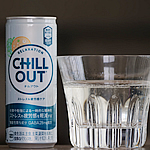
This is a review of "CHILL OUT Stress & Fatigue Care," which was renewed and released on May 26, 2025. As a leading brand of relaxation drinks, it's often seen as the exact opposite of an energy drink.
With this renewal, I was given the opportunity to try the new CHILL OUT. To be honest, I had never tried CHILL OUT before, so this is actually my very first experience with it.
 Author: Energy Drink-kun
In 2001, while living in the United States, I encountered energy drinks through the dance scene and was deeply impressed. After returning to Japan, I found that energy drinks were considered novelty beverages, so I established a comprehensive website in 2013 to share the true appeal of energy drinks. As an energy drink enthusiast, I began drinking them seriously again, collecting over 8,000 varieties of energy drinks from various countries. I am also active as a critic and expert, receiving media interviews.
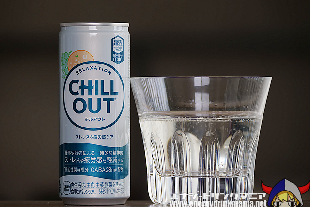
Flavor of CHILL OUT Stress & Fatigue Care
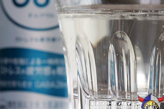
When opened, a refreshing citrus aroma bursts out. The liquid itself is clear and colorless.
As I took a sip, I noticed light citrus flavors like orange and grapefruit, enveloped by notes reminiscent of maca extract and something slightly like air freshener.
It has a light texture and a smooth mouthfeel that doesn’t linger.
Although it contains a standard amount of sugar, it doesn’t feel overly sweet. My first impression was, “It’s such a light and clear flavor.”
There is a faint muscat flavor combined with a slightly air-freshener-like scent that might be a bit off-putting, but overall the taste and aroma aren’t flashy. The overall impression is quite natural.
The combination of this flavor and the well-balanced 250ml size makes it perfect for quiet and peaceful moments. I imagine there are quite a few people who enjoy the taste of CHILL OUT itself—independent of its relaxation ingredients—and keep coming back for it.
Energy Ingredients of CHILL OUT Stress & Fatigue Care
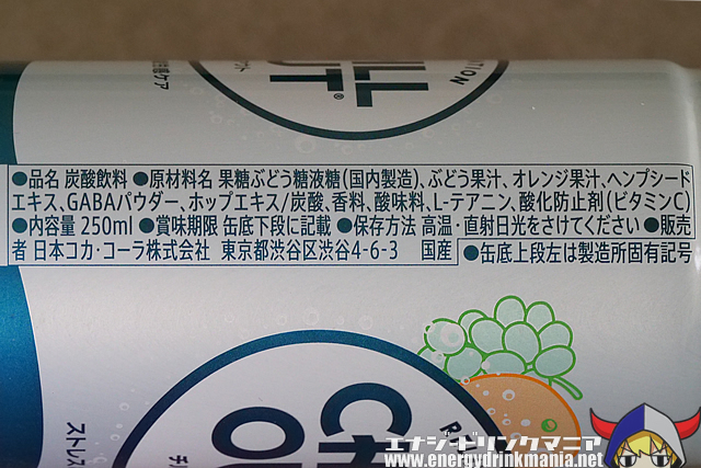
As a relaxation ingredient, it contains 28mg of GABA, which helps reduce stress and fatigue. It also includes other relaxing components such as hemp seed extract and theanine.
One point of concern is the inclusion of sugar. The flavor is excellent and makes me want to drink it at the end of the day, but knowing it contains sugar makes me hesitate just a little.
Design of CHILL OUT Stress & Fatigue Care
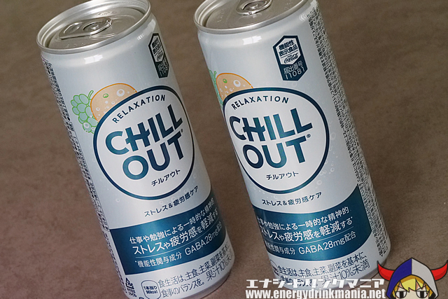
The brand image remains the same, featuring a pale light gray with a hint of blue that highlights CHILL OUT’s signature brand colors.
With this renewal, CHILL OUT has become a "Food with Functional Claims," now featuring GABA as a functional ingredient. As a result, the front of the can now includes much more text about its effects and ingredients.

In addition, the katakana “チルアウト” has been added below the brand name, and the new product name “Stress & Fatigue Care” makes the concept more understandable to a wider audience.
On the flip side, I feel that the original “cool image that spoke volumes without saying much” has faded a bit since the initial launch of CHILL OUT.
There’s a soft, gentle illustration of orange and muscat to represent the flavor on the front of the can.
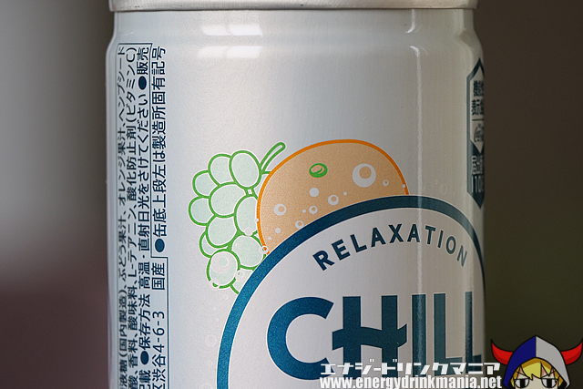
This visual representation of the flavor was also part of the pre-renewal design.
When it was first released, CHILL OUT had the image of a mysterious beverage—one where you couldn’t tell what it would taste like just from the packaging. That sense of mystery can be effective in building a brand image. However, relying solely on that strategy likely has its limitations when it comes to boosting sales. By clearly communicating the flavor, I suspect they’ve been able to appeal to a new audience and see some measurable results.
One notable point in this renewal is its positioning as a Food with Functional Claims. The statements about added value brought by this change, whether positive or negative, could have a major impact on the brand image. Especially for a fashion-forward brand like CHILL OUT, it's fascinating to see how clearly stated effects and benefits—as well as easy-to-understand Japanese labeling—might shape its brand identity going forward.
 Since 2001, Energy Drink Maniac has been drinking energy drinks and providing the most detailed reviews of global energy drinks based on firsthand research.